Project Overview
This personal project involved a visual redesign of the LocumNet Portal job listing website. The primary goal was to improve the overall aesthetics and professionalism of the site while maintaining its functionality. The previous design felt cluttered and outdated, so the redesign focused on creating a modern, clean, and user-friendly interface.
Design Goals
- Enhance the overall professional look and feel
- Improve readability and visual hierarchy
- Ensure a clean, modern, and user-friendly design
Design Process
- Analyzed the existing website to identify key areas for improvement.
- Developed a style guide to maintain consistency in colors, typography, and spacing.
- Redesigned the hero section for a stronger first impression.
- Refined job listing cards and filters for better user interaction.
Before & After
The redesign improved various aspects of the LocumNet Portal:
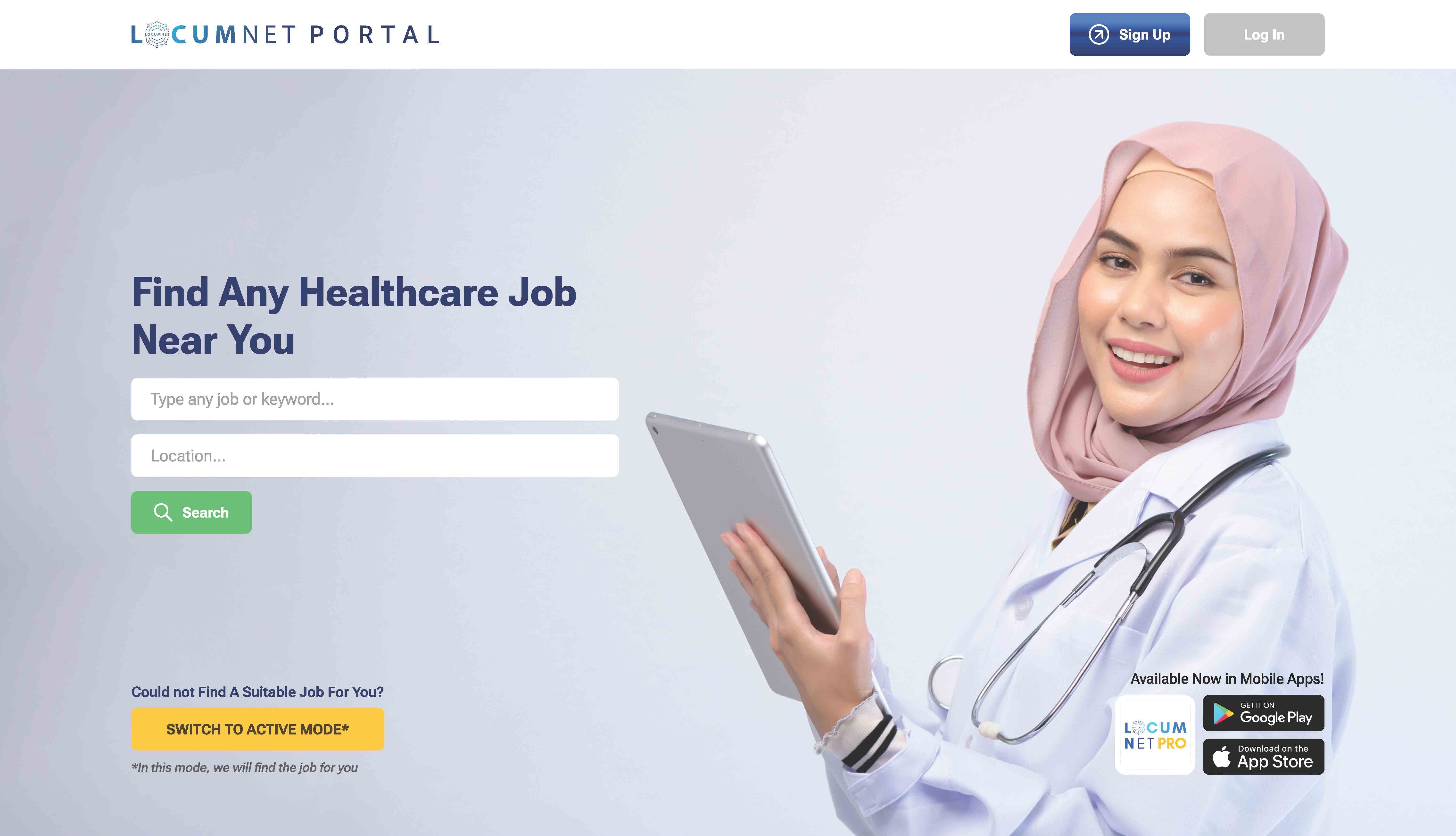
Hero Section
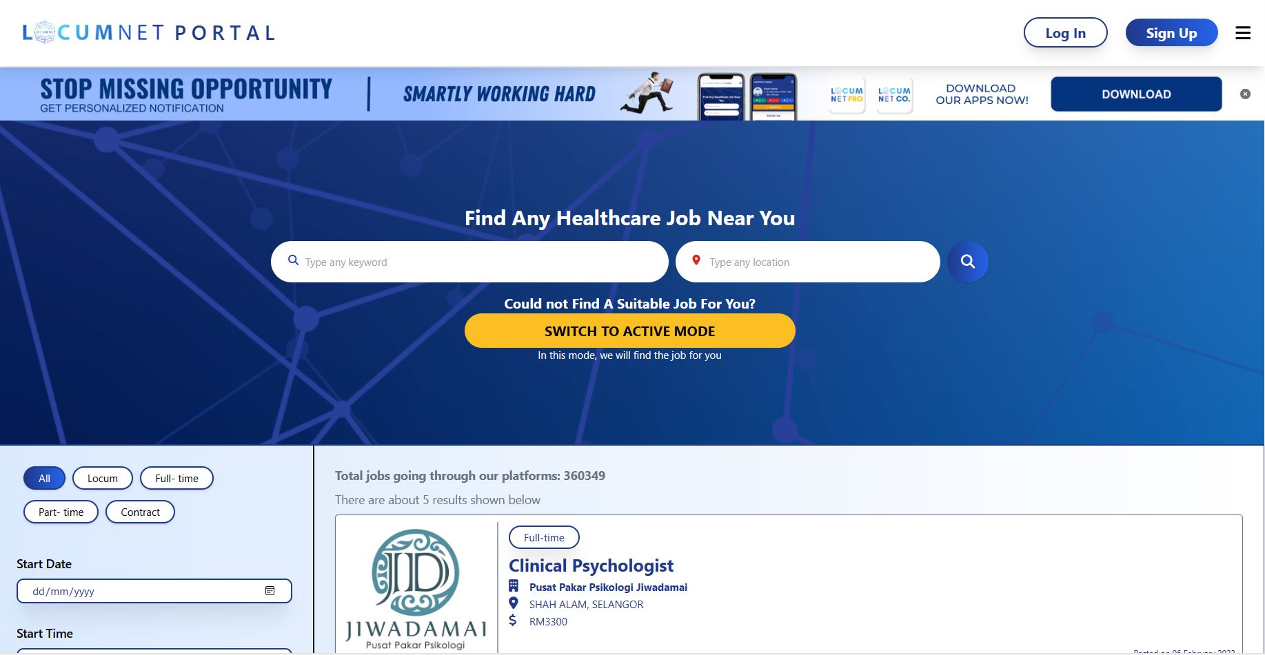
Before: Cluttered banner with excessive text and small icons.
After: Sleek, minimal design featuring a welcoming image and focused job search area.
Job Listings
.jpg)
.jpg)
Before: Listings looked dense and lacked spacing.
After: Improved spacing, clearer job categories, and better typography for readability.
Filter Section
.jpg)
.jpg)
Before: Plain and unstructured.
After: More intuitive layout with distinct buttons for job types and filters.
Footer
.jpg)
.jpg)
Before: Bland and lacking engagement.
After: More engaging, featuring a mobile app promotion and social media links with better spacing.
Reflection
This project helped refine my UI design skills, particularly in layout structuring, font selection, and visual hierarchy. It also reinforced the importance of maintaining a balance between aesthetics and usability.
Tools Used
- Figma
- Adobe Photoshop