Project Overview
This project focused on revamping the UPA website to create a more visually appealing and professional online presence. The previous design appeared minimal and lacked engagement, making the user experience feel empty. The redesigned version introduces a modern, well-structured layout that enhances product presentation and overall usability.
Design Goals
- Improve the overall aesthetic to appear more polished and professional.
- Make better use of space to prevent the site from looking empty.
- Enhance user engagement with a dynamic hero section featuring a product slideshow.
- Maintain brand consistency while improving navigation and readability.
- Organize product listings to avoid unnecessary duplication and improve clarity.
- Build trust with users by adding a "Why Choose Us" section.
Design Process
- Research & Analysis — Evaluated the existing design, identifying gaps in visual appeal and user experience.
- Wireframing & Layout Planning — Designed an improved layout that makes better use of available space.
- Hero Section Enhancement — Introduced a product slideshow to create a dynamic and engaging first impression.
- Product Presentation Optimization — Combined similar products and added an additional button for personalized notebook options to reduce redundancy.
- Banner Improvement — Redesigned the banner to be more visually appealing and engaging.
- Trust-Building Elements — Added a "Why Choose Us" section at the bottom to increase user confidence in the company.
- Refinement & Finalization — Ensured alignment with branding guidelines and optimized usability.
Before & After
The redesign improved various aspects of the LocumNet Portal:
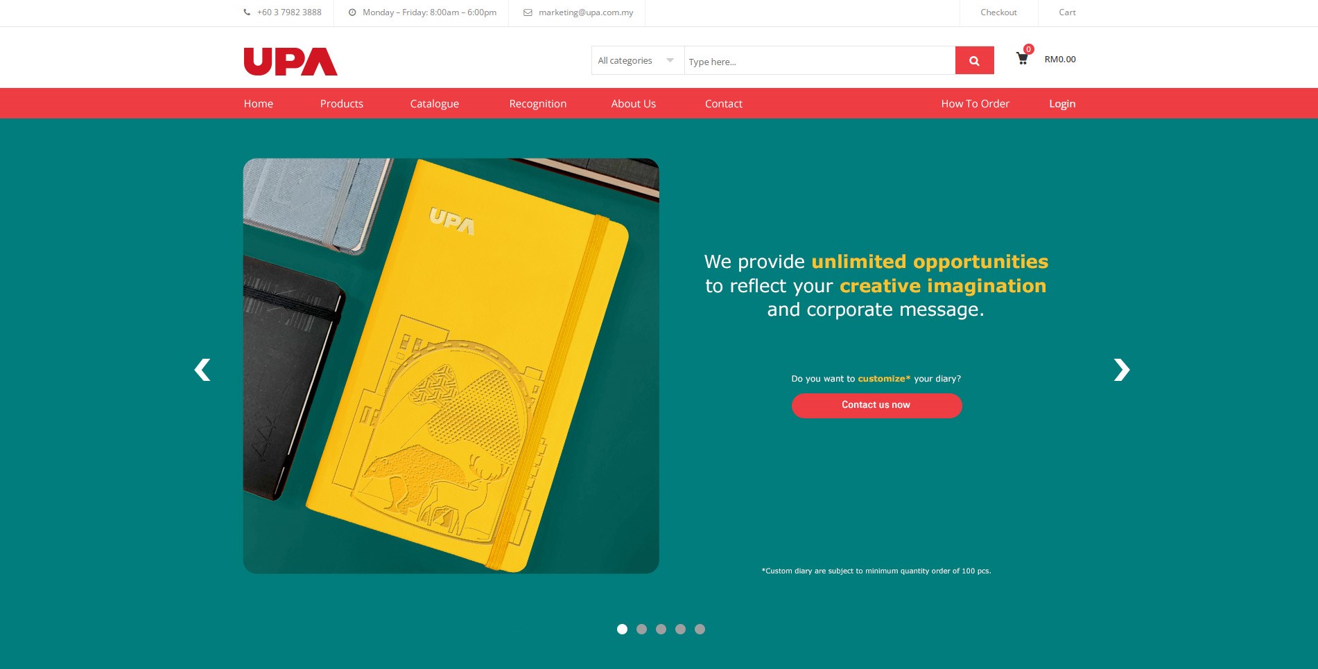
Hero Section
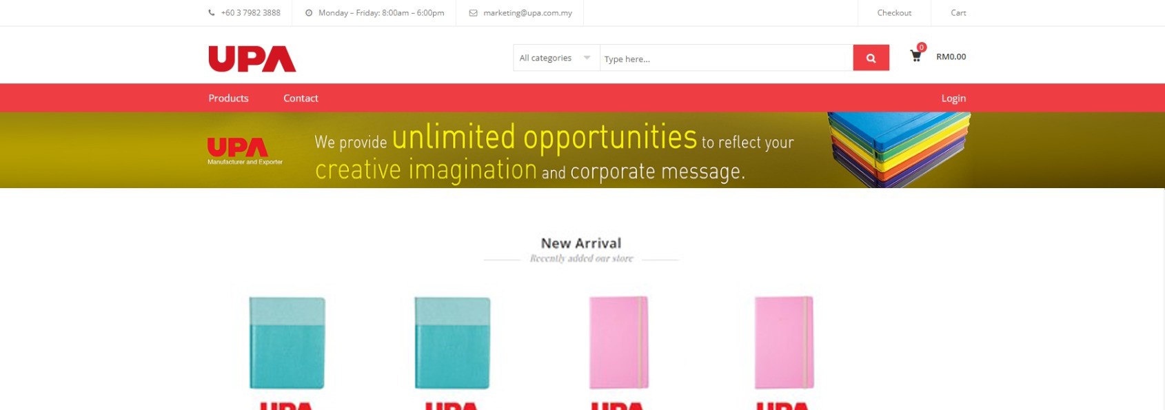
Before: Static and minimal, with a small and uninteresting banner.
After: Features an engaging slideshow displaying various products, making the site feel more dynamic and professional.
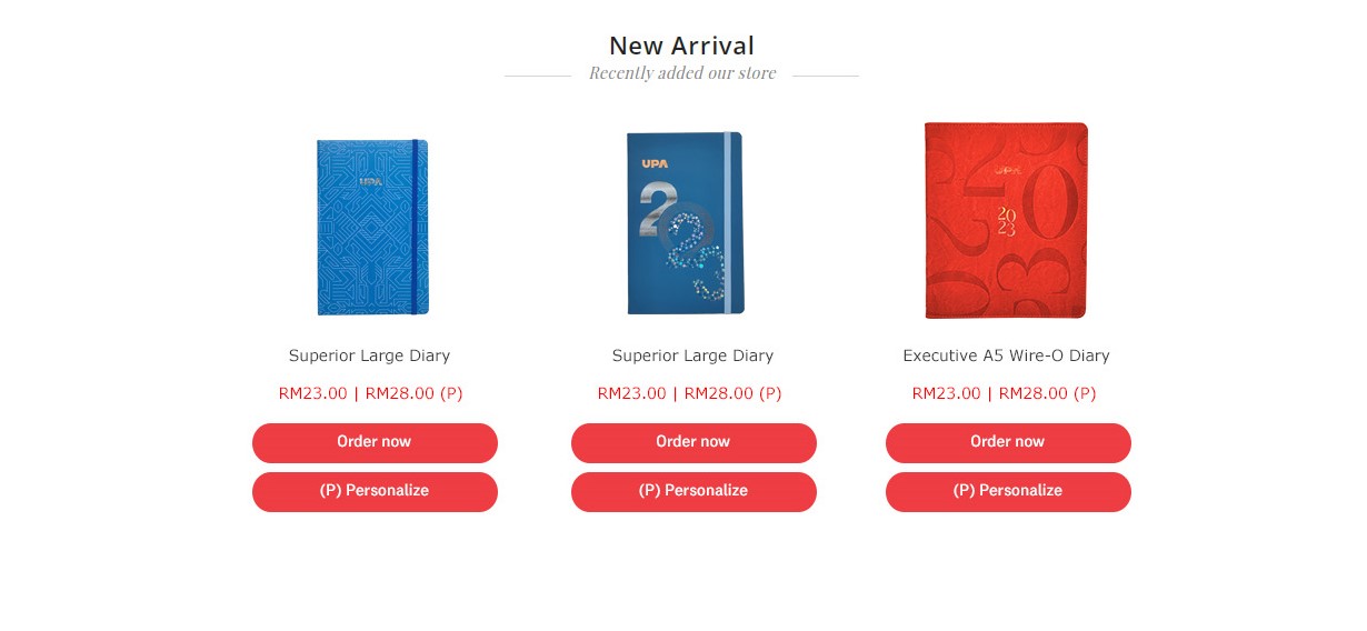
Product Listings
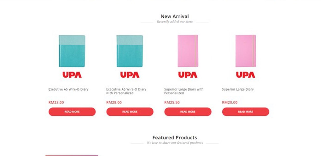
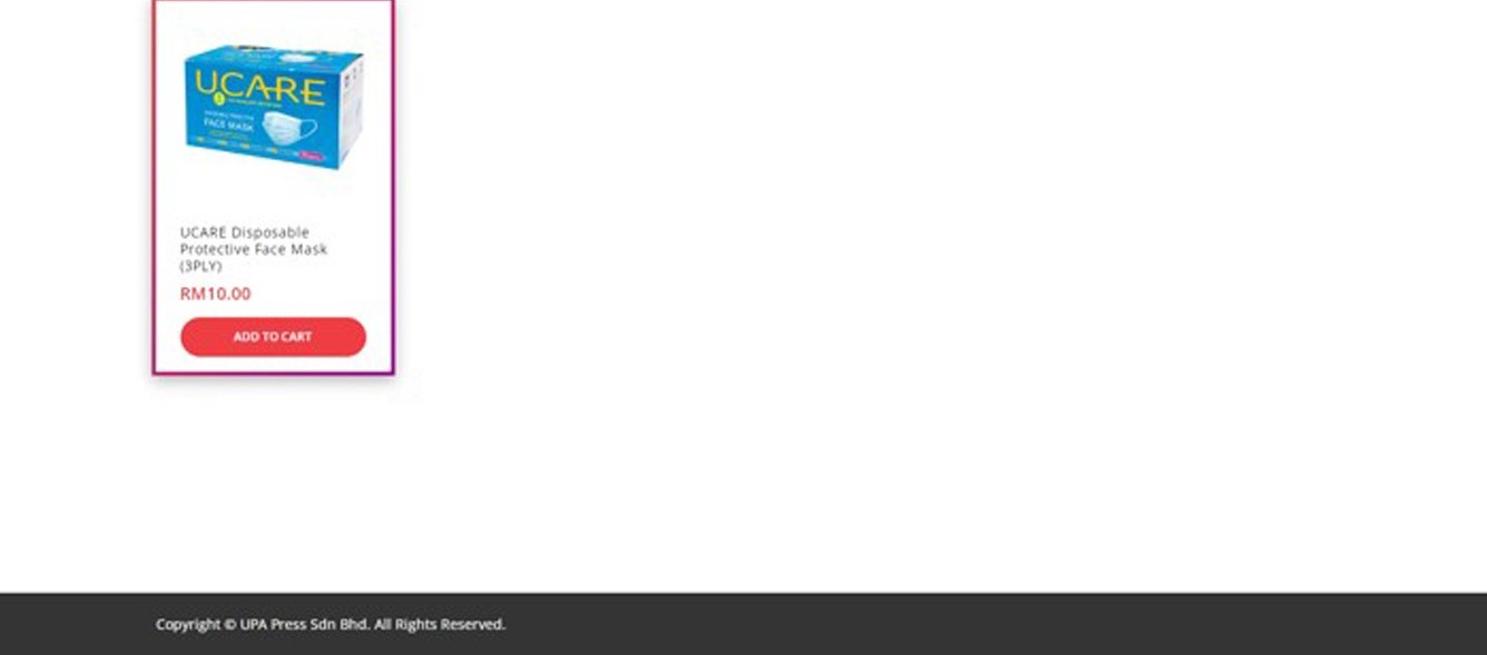
Before: Products were duplicated to provide options for personalized notebooks, leading to clutter and confusion.
After: Similar products were combined with an additional button for personalization, creating a cleaner and more organized presentation.
Trust & Credibility
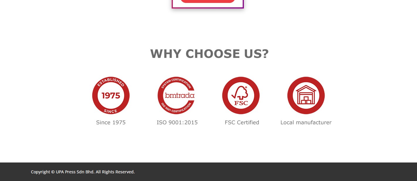
Before: No section highlighting company strengths or credibility.
After: Added a "Why Choose Us" section at the bottom to build user confidence in the company.
Reflection
This project provided valuable insights into enhancing an e-commerce site with a limited product range. By incorporating engaging elements like a slideshow, optimizing space, and organizing product listings effectively, the design now feels more professional and visually appealing while maintaining a clean layout.
Tools Used
- Figma
- Adobe Photoshop